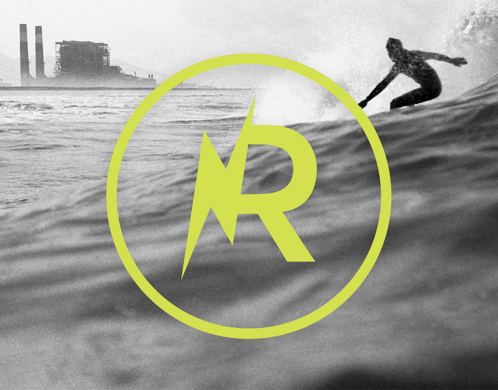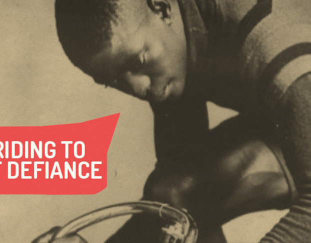
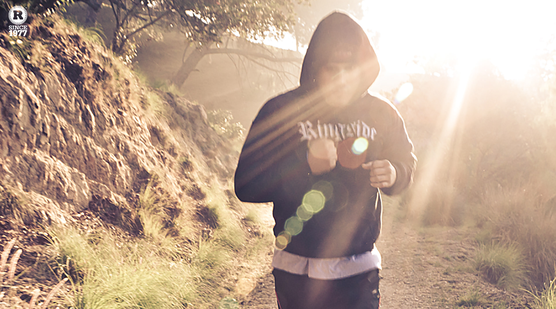
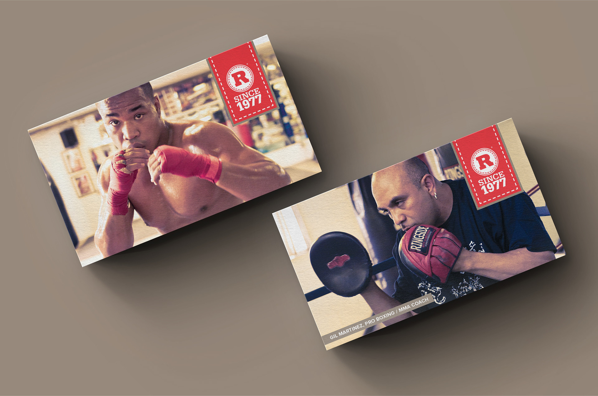
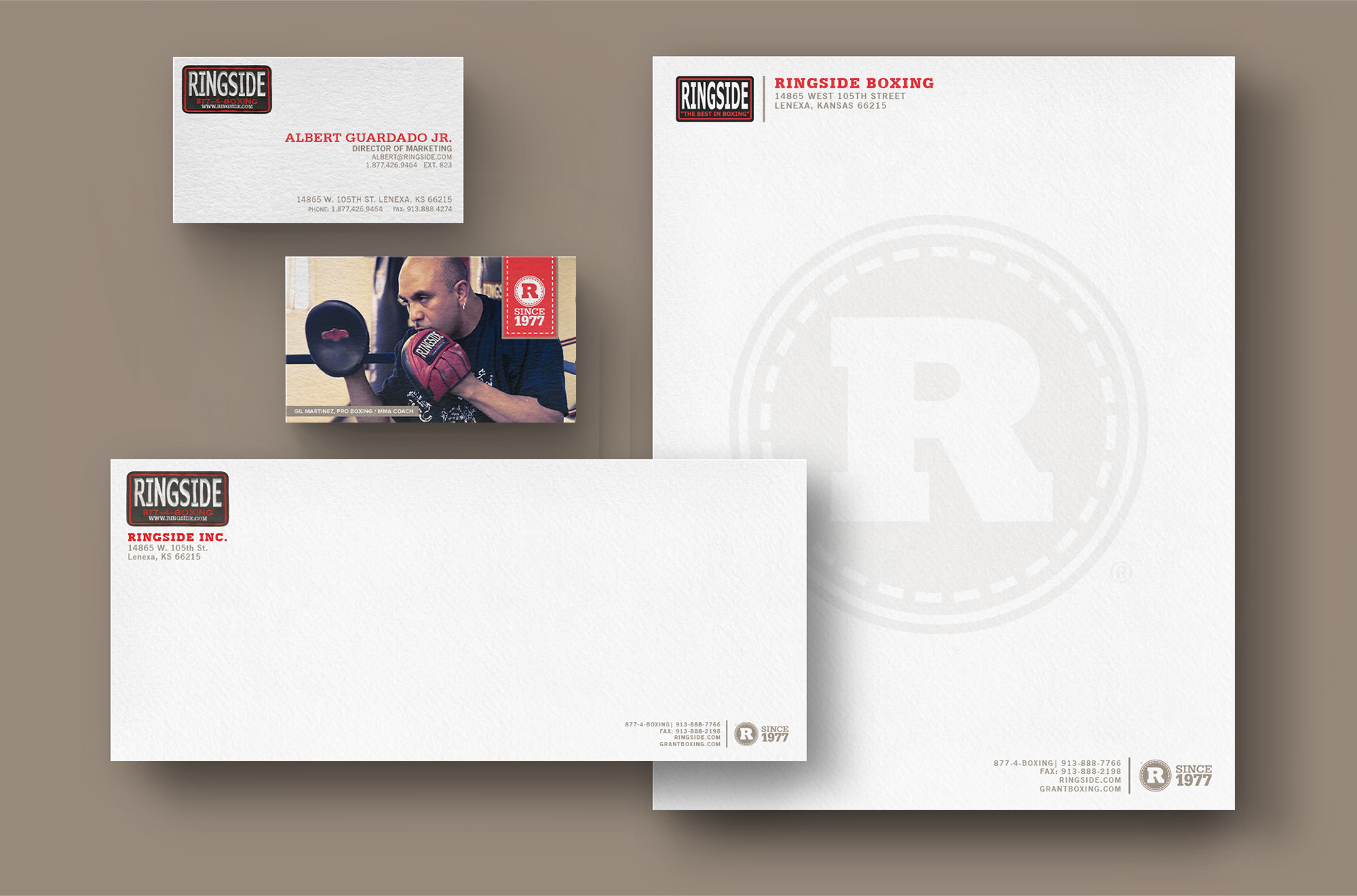
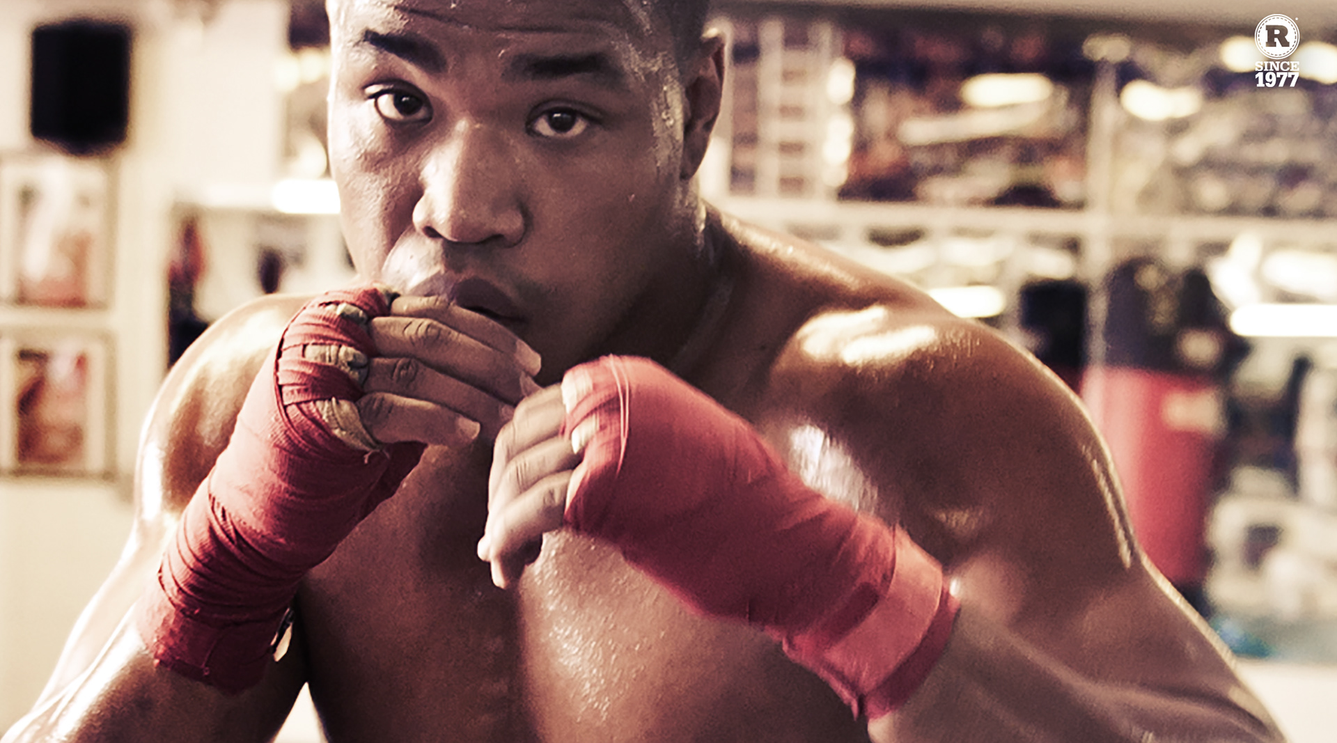
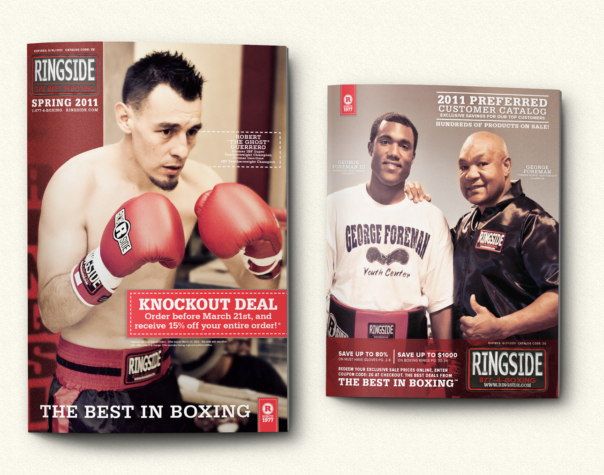
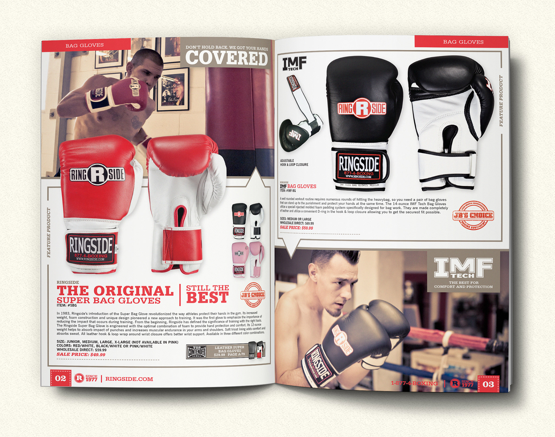
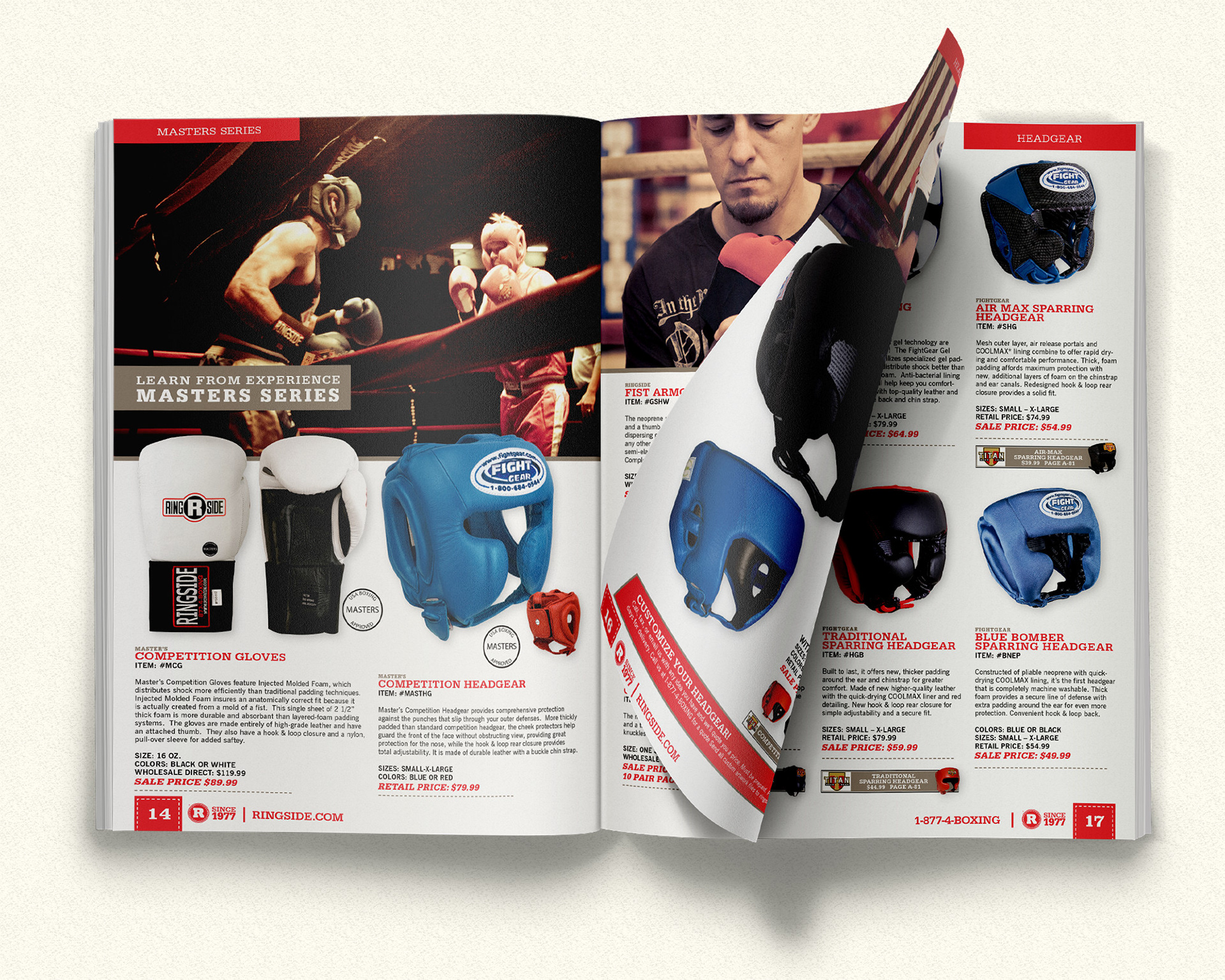
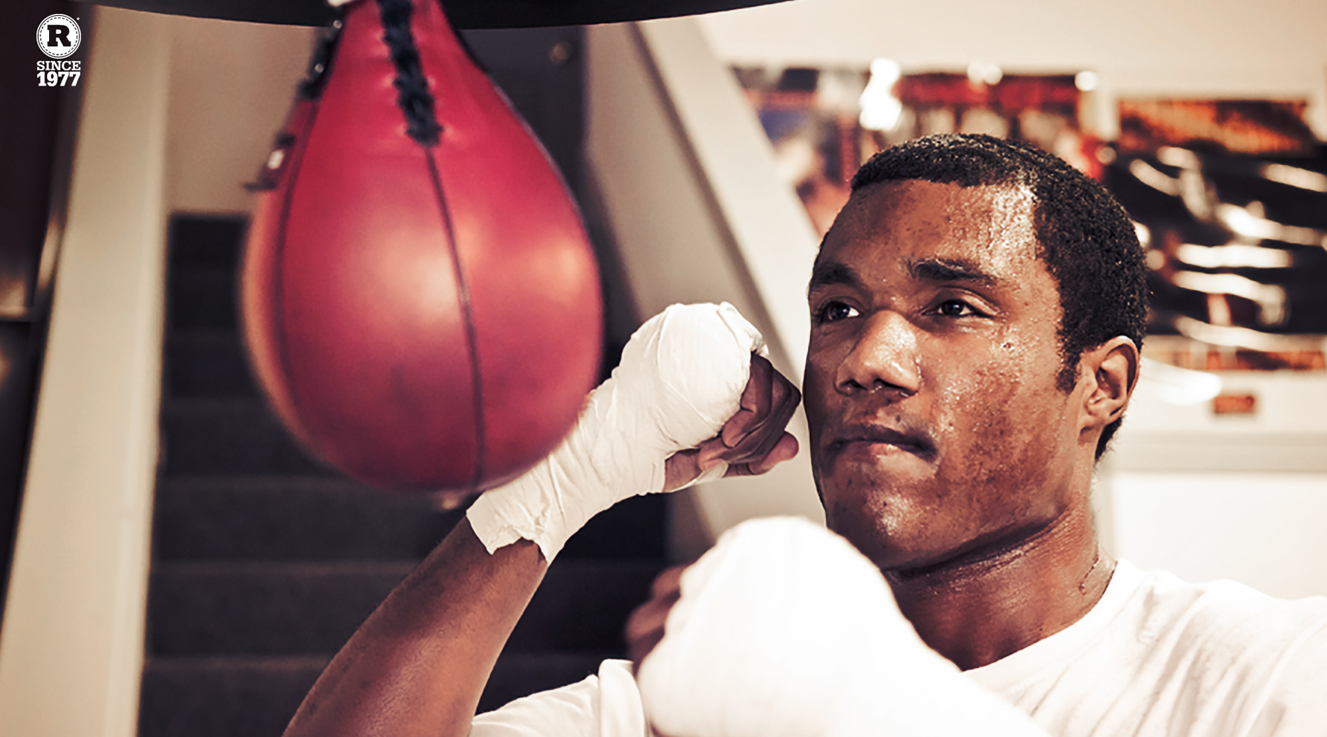


Bringing a boxing brand back into the ring
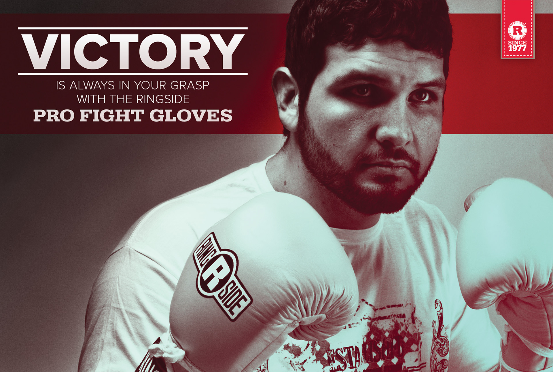
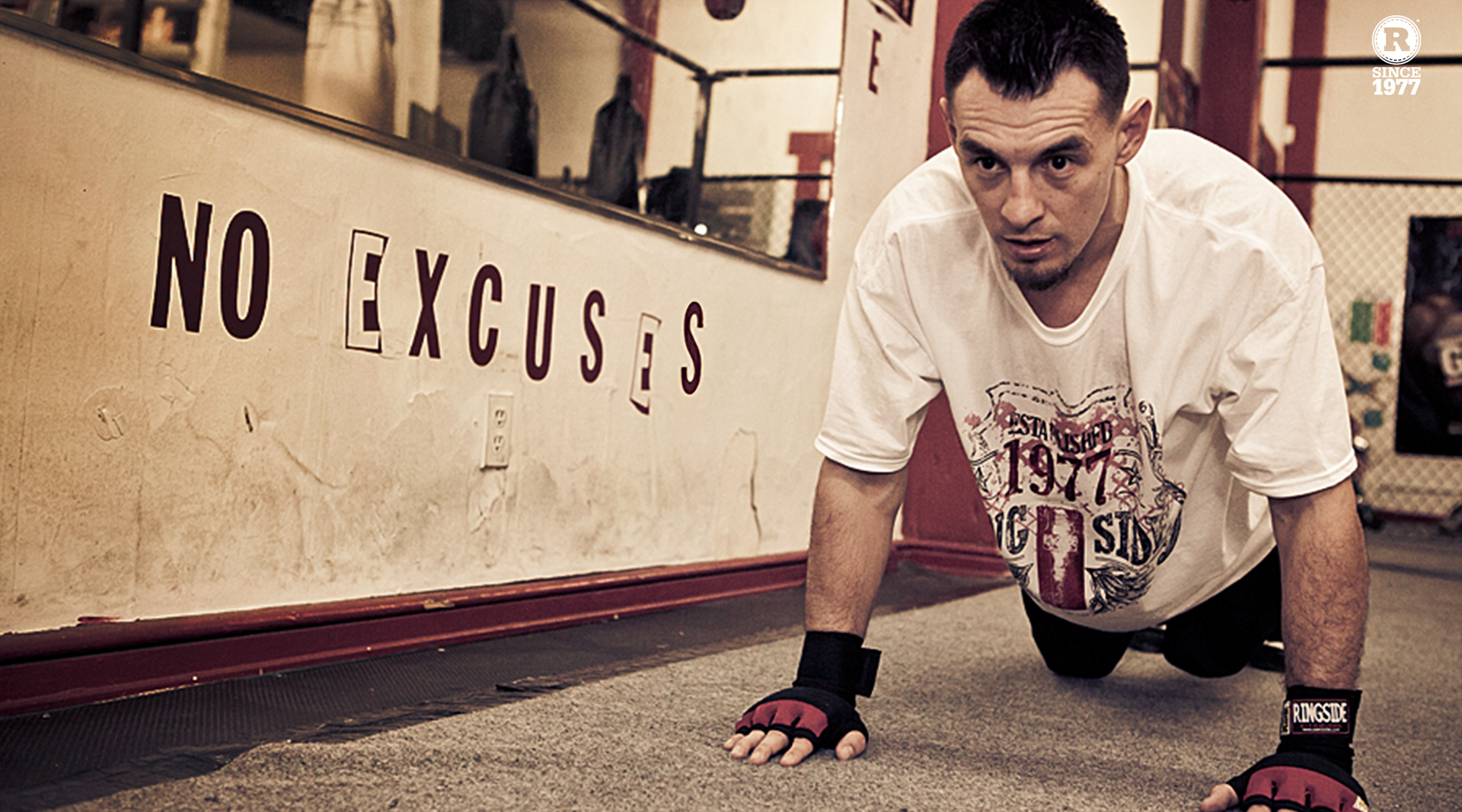
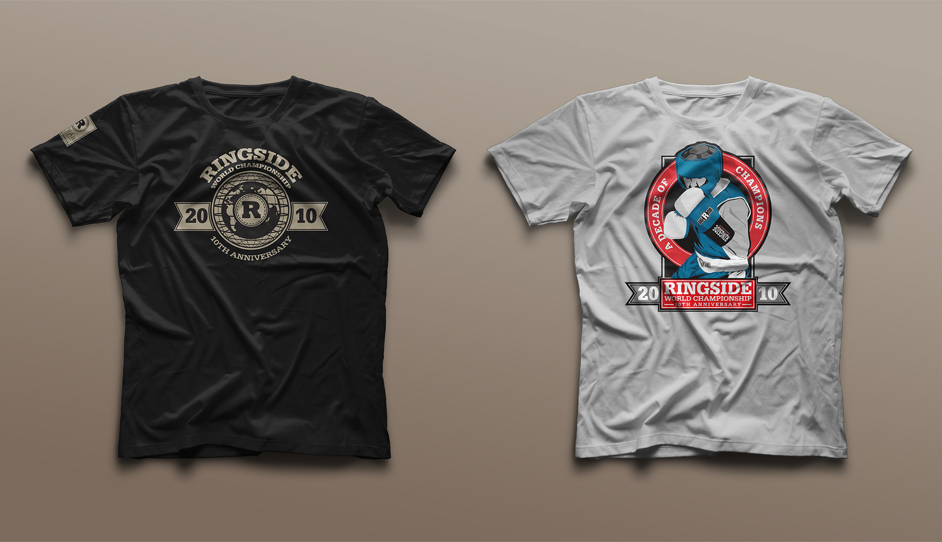
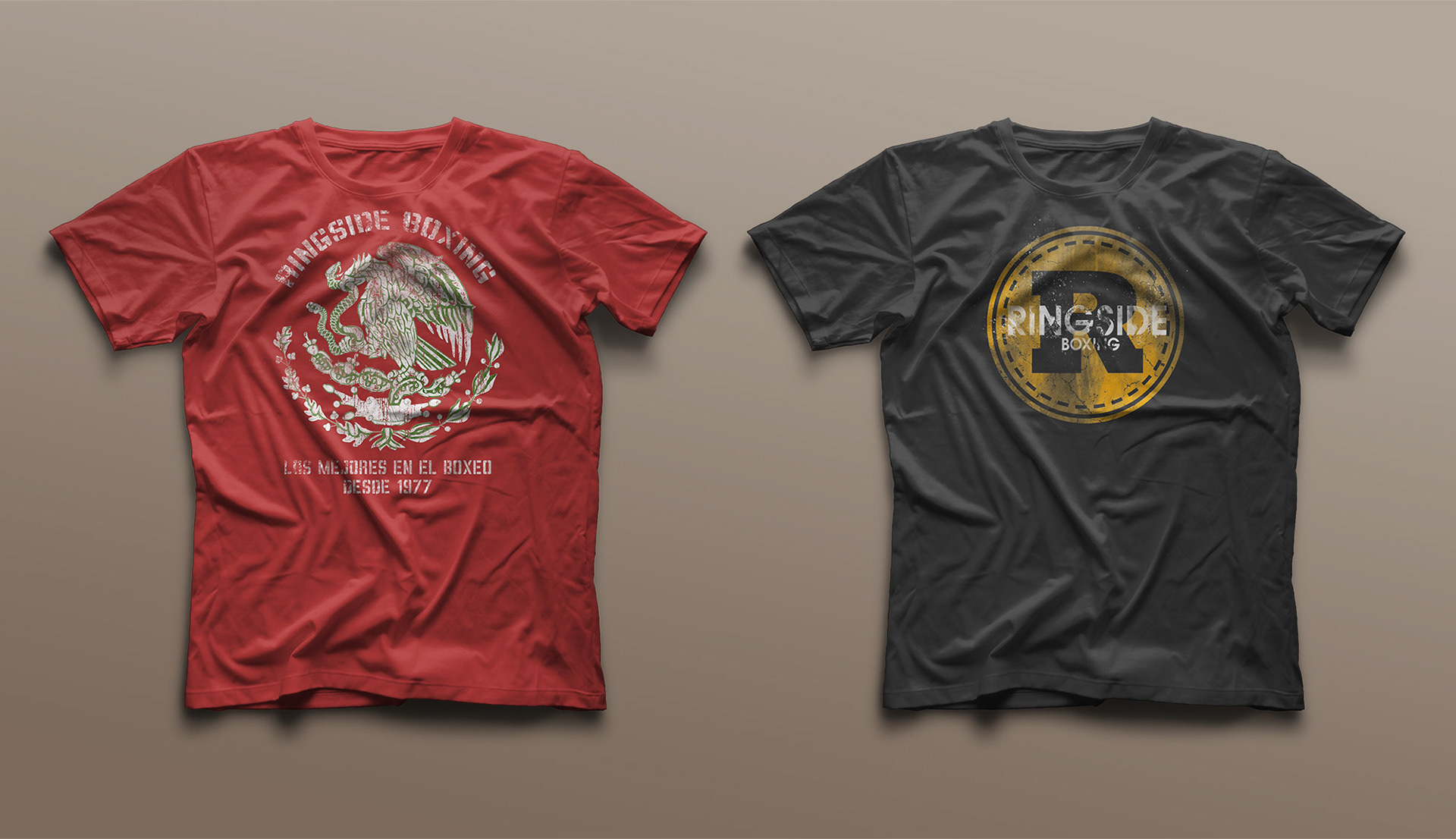
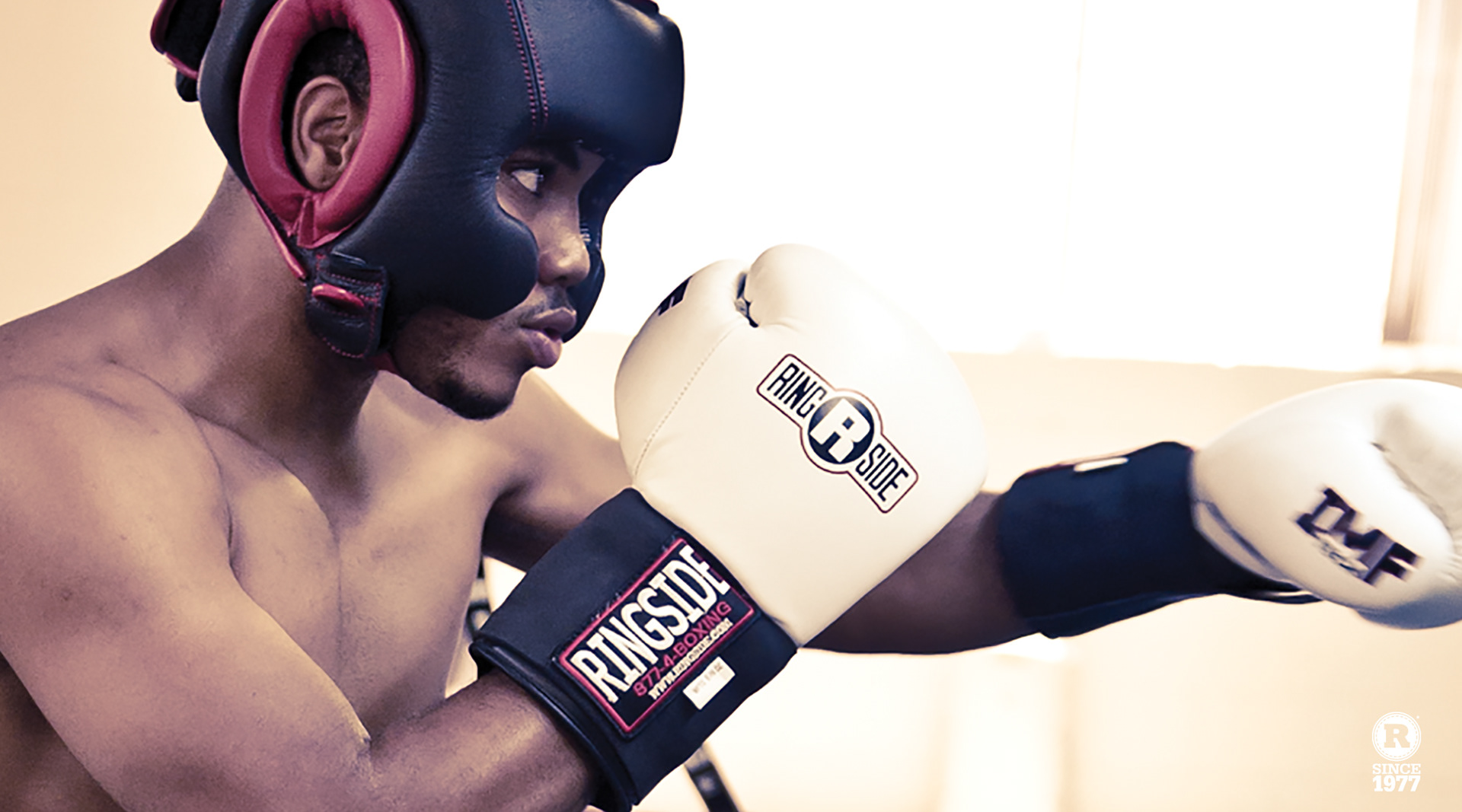
Ringside has been an important part of boxing since 1977 but the brand still felt like it was from that era. The brand was updated with a cleaner look that still had a classic feel. The R icon was developed to work on product and campaigns without overpowering the traditional logo. An updated color pallete, graphic elements and type styles were also introduced. Ringside's photography style was also evolved with a patina that captures the classic boxing gym roughness.